The Worst Of The Fifty Flags
November 26, 2018
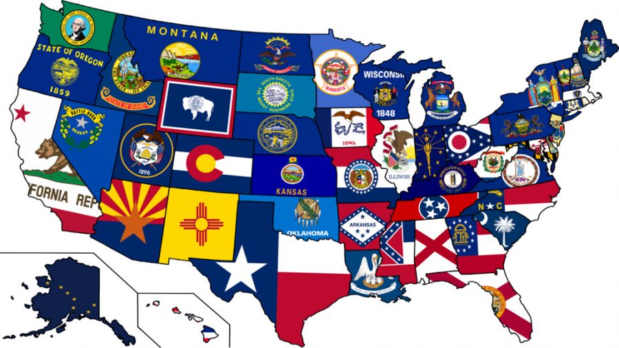
I love flags. Flags are what represent not just countries, but ideas. One thing I love about the world is that anywhere can have a flag. In the United States of America, there is a serious state flag problem. Of the fifty flags that represent each state, only 21 of those can really be called flags. The rest are literally the state seal slapped on a blue or green background. This article is going to be ranking all of the bad flags.
Those bad flags belong to the states of Connecticut, Delaware, Idaho, Illinois, Kansas, Kentucky, Louisiana, Maine, Massachusetts, Michigan, Minnesota, Montana, Nebraska, Nevada, New Jersey, New York, North Dakota, Oklahoma, Oregon, Pennsylvania, Rhode Island, South Dakota, Utah, Vermont, Virginia, Washington, West Virginia, Wisconsin, and Wyoming.
Although we are the land of opportunity, we aren’t the land of creativity. Without further ado, I present the worst 29 flags of the Union and why they are bad.
If you take a look at any of these flags from afar and nobody told you the name of them, you wouldn’t know the difference. For example, the flags of New York and Michigan. If they were waving in the wind far away from you, most likely you couldn’t tell the reason for this. The reason is that they look almost identical. This goes for the flag of Maine as well. The majority of the flags just look too similar.
A different reason why they are bad flags is because of the colours. When you have a seal on the flag, that is where your eyes go first. The problem with this is that on many seals, there are over 4 colours within it. This is a big problem because too many colours are distracting. The flags also have a problem with too much detail in the seal (NY for example). The amount of detail makes you wonder why they didn’t just take the seal and put that as the flag only.
The last reason why these 29 flags are bad is that you can’t tell what they are trying to represent. With Texas’s flag, you’ve got the Lone Star. With Ohio’s flag, you’ve got the 17 stars. On Connecticut’s flag, you have… grape vines? Looking at this, you can’t understand what it is supposed to mean. This is a recurring theme with all of these flags.
What I am thinking is that these flags are too repetitive. What can we do about it? Well, not much really. We can think of cool designs that look a lot better, but we can’t do much about these bad flags. Does it really matter though? I mean… no. Flags are, after all, symbols of us. Who knows you better than you right?

